Studline
Couch'Tard
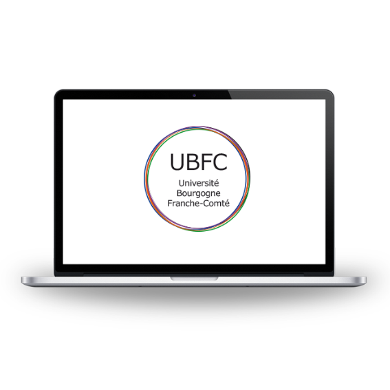
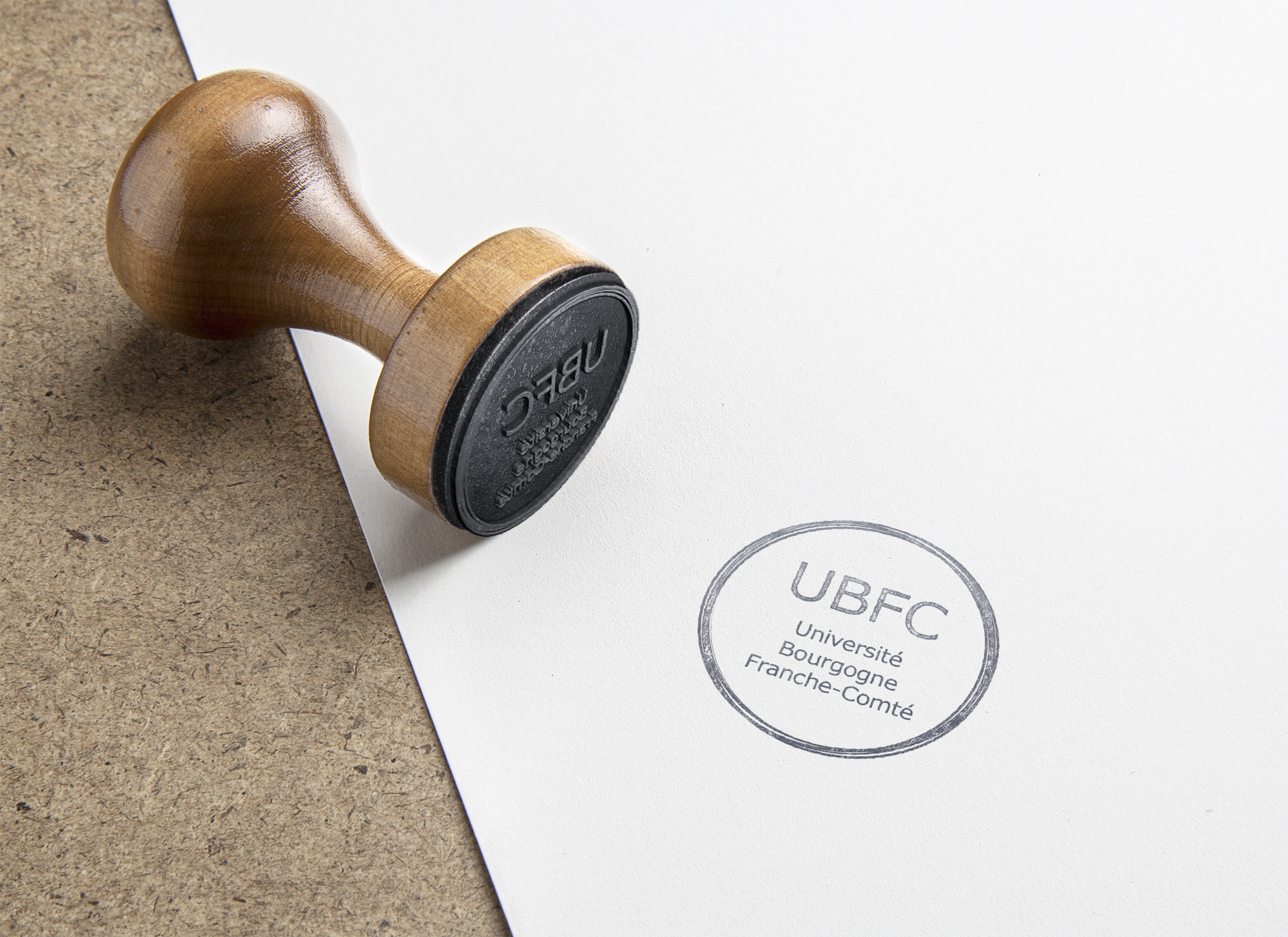
UNIVERSITÉ DE BOURGOGNE FRANCHE COMTÉ
Logotype // Graphic Designer
This project consists in developing the logotype of the University of Bourgogne Franche-Comté further to the realization of a study of creative briefing, a study of the competitors, the researches papers realized on the logo, to arrive finally at digital searches on the logotype following various graphic tracks of logos, until find the final adequate proposal of logotype. Afterward I realized a file on this logo.
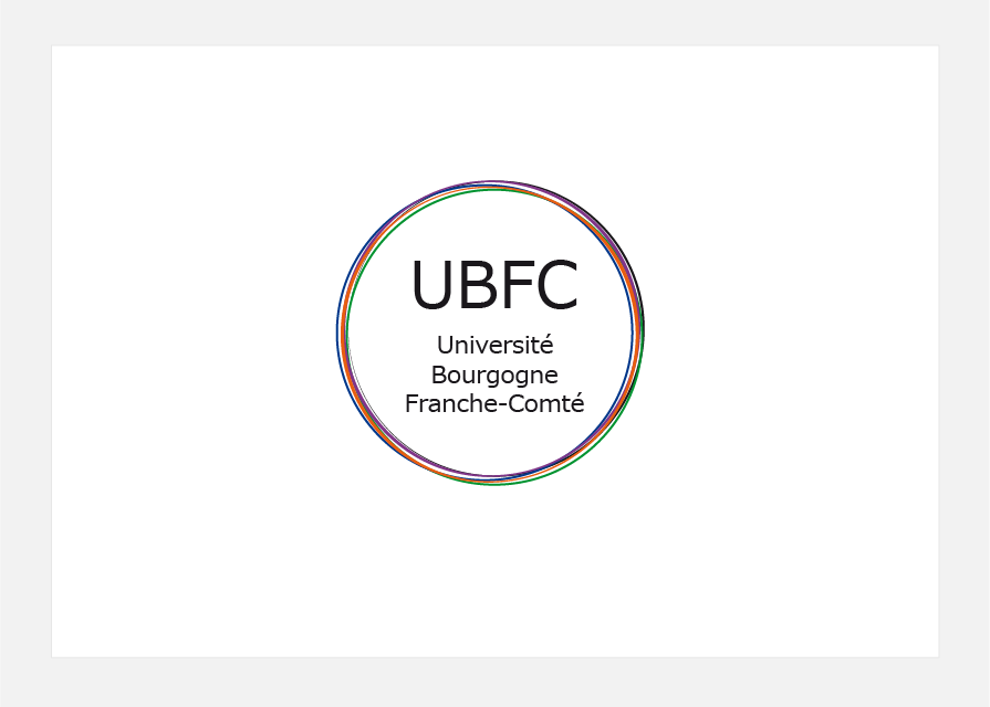
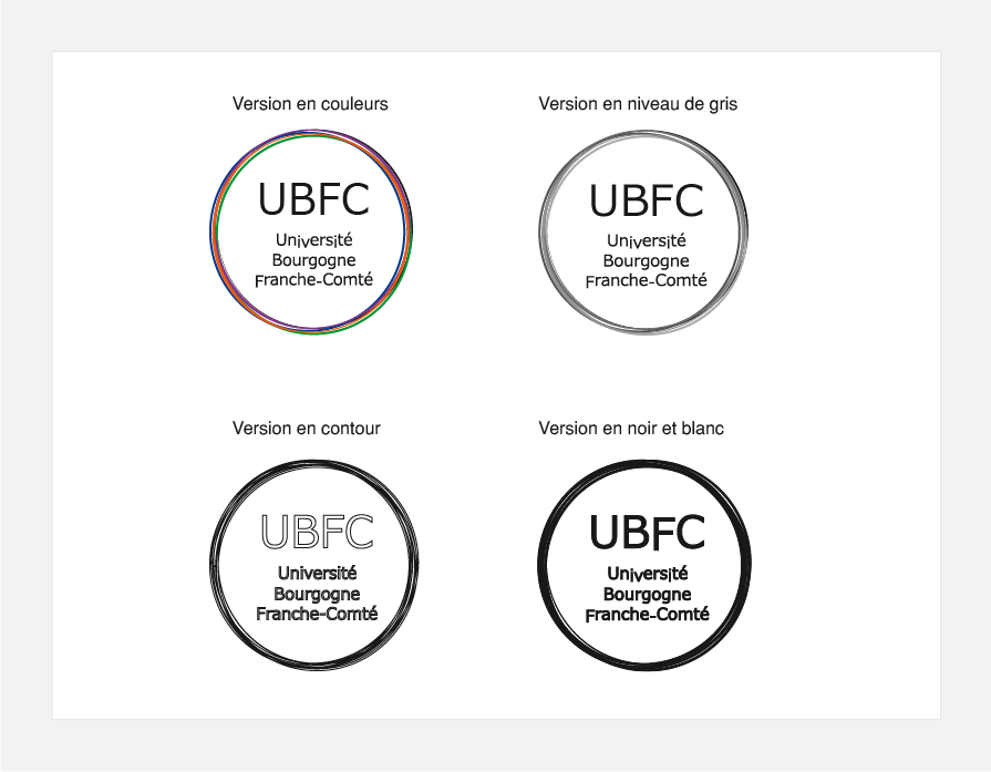
I chose to realize the logo of the University of Bourgogne Franche-Comté in several interlaced circles showing the union of the various establishments making up it, to show that they are together welded with the aim of passing on, innovating and excelling.
Besides, I used a simple and straight typography so that we can memorize it quickly and remember it more easily. Concerning the colors of circles, I preferred to resume the former colors used for the logos of the University of Bourgogne and the University of Franche-Comté, that is the orange and the green, and to associate it colors blue and purple for the other circles. So, the colored harmony is more coherent.
Illustrator // InDesign